Designing an Acumatica Dashboard
Dashboards in Acumatica are a great way for users to see an overview of the data in the system. Dashboards are the main screens users see when they log into their Acumatica system and are configured to each user, making the data very customizable for each department and role.
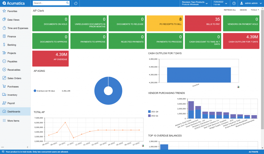
In the screenshot above, users can see an example of a dashboard for the Accounts Payable Clerk when logging into Acumatica.
The dashboard screen has a variety of colors, tiles, graphs, and widgets. Each of these can be changed using the design button on the top right of the screen. Clicking the design button will allow users to edit each of the individual widgets on the screens. Users have a variety of options:
- Colors: Different colors for different “alarm levels” can be set to view on the dashboard. These colors can be set to whatever the user chooses as well as when they want to be alerted.
- Visual: Users can choose to view data in the forms of tiles or a variety of graphs. In addition, users can input wiki screens and even the weather as a portion of their dashboard.
- Verbiage: Graphs and tiles can be named whatever users choose to describe the tile or graph.
- Inquiry Screen: Users choose the inquiry screen from which the data is pulled. For example, on the screen shot above data is being pulled from AP overdue, total AP, and several others.
There are several other things that can be designed on the dashboard screen to make it configured to each user who is going to be in the Acumatica system.
If you think that dashboards would be a good addition to your company, please contact Polaris Business Solutions at info@polaris-business.com.

